

MyMonthlyCharts, Premium Fertility, and Perimenopause Journaling are now all FREE!

Page 3 of 8
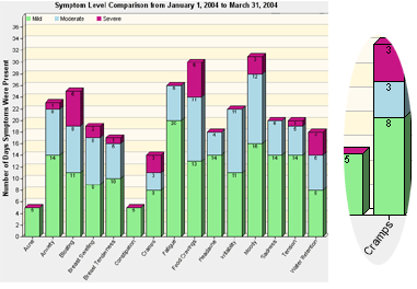
Your Symptom Comparison Chart
This chart compares any group of symptoms over any time period, showing which symptoms are bothering you the most, and how much each affects you (green:mild; blue:moderate; red:severe).
In this sample, selected symptoms are compared in the time period January to March. The inset shows Cramps: for 8 days in this period they were mild, 3 days moderate, and 3 days severe.

Screenshots may be reduced in size. All chart data is for demonstration purposes only.